The Tennis Poster Is Not a Miniature Scoreboard
A tennis poster can set an event’s mood without listing match details. Use type, image and empty space to make its purpose clear at a glance.
How do you make a tennis poster feel like an event rather than a fixture list? Start by deciding what a passer-by should feel before they know who is playing. A tennis poster’s hierarchy of type, image and space can establish that mood without squeezing a schedule into the layout.
The job is not to hide useful information. It is to give the event a visual identity, then make the essential practical details easy to find. Treat the poster like a court-side chair: it has one clear purpose, and it becomes awkward when asked to do everything else as well.
Choose the event’s mood before choosing its imagery
Write a short description of the occasion in ordinary language. A neighbourhood doubles afternoon might feel sociable and informal; a night exhibition could feel theatrical, quiet or slightly grand. Avoid broad labels such as “exciting” until you can say what would make the event look that way.
Choose one main quality and, if useful, one supporting quality. “Calm and precise” gives you a more workable direction than “fun, bold, energetic and welcoming”. The first suggests controlled spacing, deliberate lettering and a composed image; the second is a list of wishes competing for the same patch of paper.
Keep the audience in view. A poster for club members can use familiar local cues, such as the clubhouse silhouette or a recognisable court surface. A public event needs a visual idea that makes sense without knowledge of the club’s customs.
Set the information boundary before layout
Decide which facts belong on this poster and which belong on a programme, website or booking page. The poster usually needs the event name, date, venue and a clear route to further details. It may also need an organiser’s mark or a brief invitation, depending on how it will be displayed.
Do not add draw progress, court allocations, player biographies or a full timetable merely because they are available. Those details can change, and they shift the poster’s purpose from atmosphere to administration. If someone needs the complete running order, direct them to the place where it can be maintained.
Make a rough content list before opening a design tool. Put the event name first, essential logistics next and secondary information last. This is not yet a visual hierarchy; it is a check that you know what the design must accommodate.
Write a title that carries the event’s character
The title should identify the occasion in a voice that suits it. “Summer Doubles Social” is direct and conversational; “The Centre Court Evening” sounds more formal, even if the event is a small club gathering. Neither is inherently better. The fit matters.
Use a short supporting line only if it adds meaning. “A relaxed evening of doubles and refreshments” tells a newcomer more than “An unforgettable celebration of tennis”. The latter promises a great deal while conveying little, which is an ambitious way to waste a line.
Keep essential logistics out of decorative wording. A clever title should not make the date or venue difficult to spot. If the event name needs a second line, allow it room rather than shrinking the type until it resembles small print on a racket bag.
Choose one image that sets the visual tone
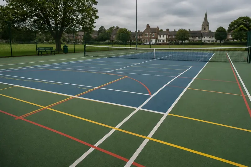
Select an image for the mood it contributes, not for the number of tennis objects it contains. A close crop of a scuffed ball can suggest play and texture; a long view of an empty court can feel expectant; a sharply drawn net can make a restrained graphic motif. One strong cue is usually clearer than a collage of rackets, balls, trophies and a player in mid-serve.
Photography and illustration solve different problems. A photograph can offer a specific surface, light or human gesture. Illustration gives you more control over line, colour and simplification, which can suit a poster intended to feel graphic rather than documentary.
Check that the image has room to work with the text. A photograph with busy fencing behind the title may need a quiet panel or a different crop. An illustration with a heavy outline may dominate delicate lettering. The image and type should share the page, not conduct separate campaigns.
Build the hierarchy from the event name down
Make the event name the first clear reading point, then set the image and practical information in a deliberate relationship to it. The image can lead if the event’s mood depends on a strong visual; the title can lead if recognition is the priority. In either case, a viewer should not have to guess what the poster is for.
Use scale, position, weight and contrast to distinguish levels of information. A large title, a supporting image and a compact logistics block can form a simple structure. Type size is only one tool: a smaller line in a quiet area may be easier to read than a larger line laid across a busy photograph.
Limit the number of type styles. Pairing a sturdy sans serif with a restrained serif can create contrast, but several unrelated faces make the poster feel assembled from leftovers. Check letter spacing and line breaks at the actual viewing size, not only while zoomed in on a screen.
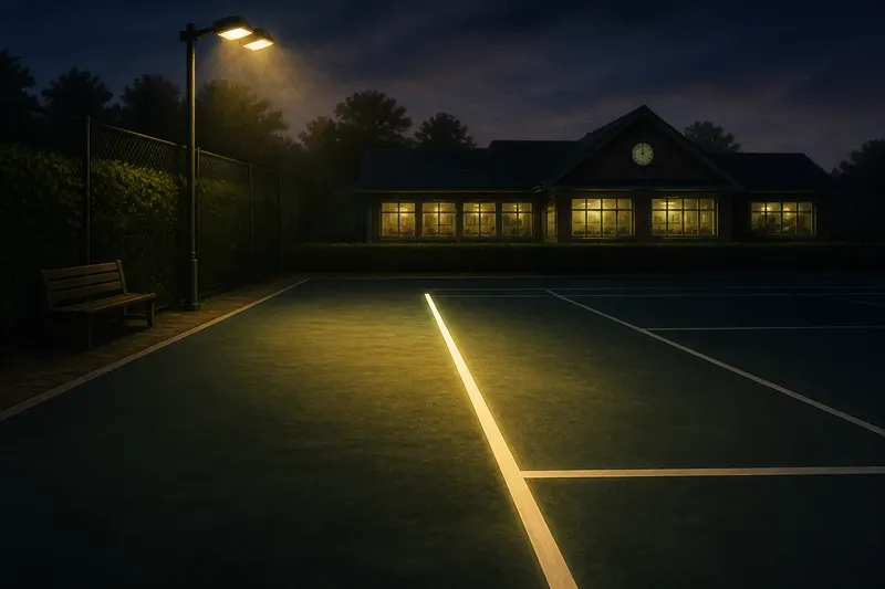
Imagine you are making a poster for an invented club event called “Courts After Dusk”. You choose an illustration of one illuminated service line, set the title in broad, calm lettering and place the date and clubhouse name together beneath it. The expected visible result is a poster that reads as an evening occasion before the viewer reaches the small practical details.
Use empty space as part of the design
Empty space gives important elements room to register. It is not a blank to be filled by another logo, a decorative ball or a sentence about how much fun everyone will have. Leave margins around the title, separate the image from the logistics and resist crowding the corners.
Think of spacing as the pause between points in a rally: without it, every movement runs into the next. A quiet area can make a small date block easier to locate and help a dramatic image feel intentional rather than oversized.
Empty space also provides a useful editing test. If the design feels incomplete without another object, ask whether the event’s idea is clear yet. Add something only when it clarifies that idea or helps someone act on the information.
Match colour and material to the event’s atmosphere
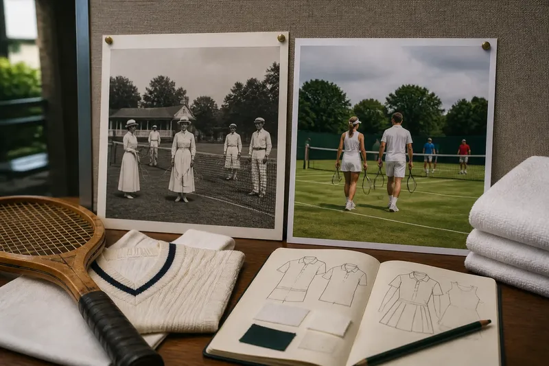
Choose a small colour palette that supports the intended feeling. Deep green and warm cream may suggest traditional club surroundings; a sharp coral against dark blue can feel more contemporary; muted clay and pale grey can echo a quieter court-side scene. These are possibilities, not rules, and the exact colours should suit the image and the place.
Check contrast before settling on a palette. A subtle colour combination can look elegant on a bright monitor and disappear on a noticeboard under uneven light. Keep the title and essential logistics legible against their backgrounds, using a plain backing shape when the image does not provide enough separation.
Consider where the poster will appear and how it will be reproduced. A design made for a phone screen may need stronger contrast and less fine detail when printed. If the printer, paper or production method is already specified, check its requirements before finalising the file; those details can affect colour and legibility.
Does a tennis poster need match details?
What information belongs on a tennis event poster?
Include the event name, date, venue and a clear way to find further practical information. Add other details only when a person needs them to decide whether or how to attend.
Can a tennis poster use a photograph?
Yes, if the photograph supports the mood and leaves space for readable type. A quiet court, a player’s gesture or a close detail can communicate more cleanly than an image crowded with equipment.
How many fonts should a tennis poster use?
Keep the choice restrained so the event name, supporting line and logistics remain distinct without appearing unrelated. A strong difference in size or weight often does more than adding another typeface.
Where should the date and venue go?
Put them together in a clear, predictable area, usually below or beside the title rather than scattered around the image. Their position should make them easy to locate without letting them take over the poster.
Review the poster as a passer-by would
Step back from the screen or print a draft at its intended size. Look briefly, then ask what you noticed first, what kind of event you inferred and whether the date and place were easy to find. If the answers do not match your intention, adjust the hierarchy rather than adding explanatory copy.
Check the design in its likely setting. A club corridor, a shop window and a social media feed each impose different distances, backgrounds and viewing conditions. The central idea can stay the same, but the title and logistics may need more contrast or a simpler crop.
Finally, remove anything that does not serve the event’s identity, image or practical clarity. A tennis poster works when the mood arrives before the fine print, while the useful facts remain close at hand. That is the point of designing for an event rather than reducing a scoreboard to paper.