Why Tennis Courts Use More Than One Line Colour
Why tennis courts use more than one line colour: learn to spot visual clutter, confusing overlaps and faded markings, then choose sensible fixes.
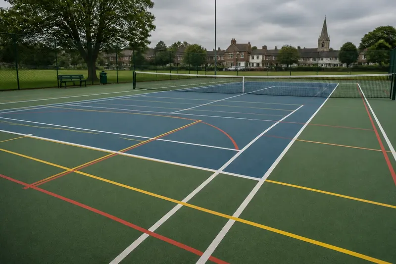
Why do tennis courts use more than one line colour? The short answer is visual clarity: on a shared court, colour can distinguish one set of markings from another before anyone has to work out what each line means. The difficulty is that extra colours can clarify a layout or make it look like a map left out in the rain.
That distinction matters most when a court carries markings for more than one activity, or when old paint, bright surroundings and awkward lighting compete for attention. A useful troubleshooting approach is to identify what the eye is confusing, find the likely cause, and then consider the least disruptive remedy. The aim is not to add colour for its own sake; it is to make the intended court pattern easier to read.
Colour helps when court markings compete
A tennis court has a familiar main outline, but a site may also use the same surface for another sport, a smaller-court format or practice layouts. Several sets of lines can cross or run close together. If every marking looks equally prominent, a player has to pause and inspect the surface instead of recognising the boundaries at a glance.
Different colours can separate those visual layers. One colour may identify the tennis lines, while another marks a secondary layout. The eye can then group each set instead of treating every stripe as part of one complicated diagram. This is a design function, not a change to the playing rules.
Colour is only one cue. Line width, spacing, continuity and contrast with the court surface also affect how markings read. A clear, unbroken line can be easier to follow than a brighter line interrupted by patches, shadows or crossing marks. Think of colour as a label on a folder: useful when it distinguishes the contents, not when every folder has a different label and none is legible.
Start with the marking that is hardest to follow
When a court looks confusing, begin by watching where attention goes astray. Is it difficult to tell the tennis baseline from a nearby marking? Do two colours cross at a busy corner? Does a line disappear against the surface in one area? Each problem points to a different cause, so repainting everything is a poor first instinct.
- Confusion at intersections: Several layouts may share a corner or cross within a small area. Identify which set should read as the primary court and whether the secondary lines can be made less visually dominant.
- A line that fades into the surface: The colour may have too little contrast with the court material, or the surface may have changed through wear or repair. Compare the marking against the court in both bright and shaded areas.
- Too many strong colours: Each set may be distinct in isolation, but equal emphasis makes the whole surface noisy. Consider whether secondary markings can use a quieter colour or a less prominent treatment.
- Uneven or interrupted markings: Wear, patching, dirt or surface texture can break a line visually. Check whether the problem follows the line itself or the condition of the area beneath it.
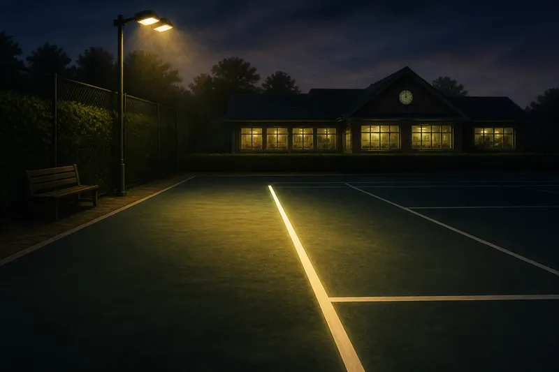
- Confusion that appears only at certain times: Low sun, court lights or shadows may reduce contrast or create misleading edges. Observe the court under the conditions that produce the problem before choosing a permanent change.
These are observations, not a prescription to repaint. The surface, the intended users and the court’s existing layout all matter. Where paint, resurfacing or site requirements are involved, follow the product maker’s instructions and any applicable local rules, and ask a qualified court-surface professional if the work affects play or safe footing.
Choose a colour system with a clear hierarchy
A useful palette gives the principal court markings the strongest visual presence and lets additional layouts remain identifiable without competing for attention. The exact colours depend on the surface. A shade that stands apart from a green or blue court may blend into a red or clay-coloured one, so a colour name alone says little about legibility.
Check contrast at the scale people actually see: from behind the baseline, across the net and while moving along the sideline. A swatch held close to the paint can look distinct while the completed line disappears at playing distance. It also helps to consider how the colours meet at intersections; a pair that seems clear side by side may become muddled where stripes overlap or run parallel.
Colour differences should not be the only way to tell line sets apart. Consistent placement and a recognisable pattern help players follow a layout, especially when lighting changes or colour perception varies. If a court’s users cannot reliably distinguish two lines by colour alone, spacing, restraint in the number of markings or a clearer layout may be more useful than another shade.
Change the least before changing the whole court
Once the source of confusion is clear, consider modest adjustments in order. First, remove avoidable visual clutter, such as obsolete markings, if the site’s operator confirms they are no longer needed. Next, assess whether the secondary lines can be made less prominent while remaining legible. Only then consider a broader colour change or a revised court layout.
Say a community court has tennis lines in white and a second set in a pale shade that nearly matches the surface. Players keep following the wrong line where the two layouts meet. The operator could first inspect the crossing in daylight and under the court lights, then compare suitable colour samples at a distance; if one alternative makes the secondary layout distinct without overpowering the tennis lines, a limited change may address the confusion more cleanly than repainting every marking.
That sequence also avoids mistaking a maintenance problem for a design problem. If one section of a line is obscured by dirt or a worn patch, changing the entire palette may leave the actual cause untouched. A local surface assessment can distinguish fading, poor contrast and physical wear, which call for different responses.
Why does a second line colour still look confusing?
Can several colours make a court harder to read?
Yes. If every layout has equal visual weight, colour separates the markings but does not establish which pattern to follow. A restrained palette and a clear distinction between primary and secondary lines usually make the surface easier to scan.
Should the tennis lines always be white?
Not necessarily as a design choice for every court surface, though an existing court may have specifications that determine its markings. The useful question is whether the principal lines remain distinct from the surface and any additional layout in ordinary viewing conditions.
What if players confuse lines only in the evening?
Look at the court under its actual lighting, because a colour that reads clearly in daylight may lose contrast beneath lamps or shadows. The issue may also be glare or an unevenly lit area rather than the colour itself.
Can a repaint solve every visibility problem?
No. Dirt, surface repairs, worn paint, line placement and lighting can all affect legibility. Identify which factor is responsible before choosing a change, or a fresh colour may simply make the same confusion brighter.
Keep the court readable after the change
After any adjustment, look at the whole court rather than judging a single stripe up close. Check the baselines, sidelines and crowded intersections from several usual viewing positions, and notice whether the secondary markings still make sense without pulling attention away from the main layout. A court is read in motion, so a design that works only while standing over a line has missed its audience.
Also note how the markings appear under different light and after ordinary surface cleaning. If a particular area remains hard to follow, record where and when the problem occurs before asking for another alteration. That gives a maintenance team something specific to assess, rather than the vague but familiar report that the court looks odd.
For anyone asking why tennis courts use more than one line colour, the practical answer is that different colours can make overlapping uses easier to distinguish. They work best as part of a quiet visual hierarchy: the main court reads first, secondary markings remain available, and the surface itself does not demand a committee meeting before play begins.